 Banco Davivienda · iF Design Award 2024
Enhanced interface, better experience.
A brand new Davivienda App. From an old, boring and difficult-to-use interface to a Super App used by more than 3 million people.
- Client
- Banco Davivienda
- Role
- Jr → Sr. UX-UI Designer
- Years
- 2021 — 2024
- Award
- iF Design Award 2024
- Reach
- 6 countries
01The change

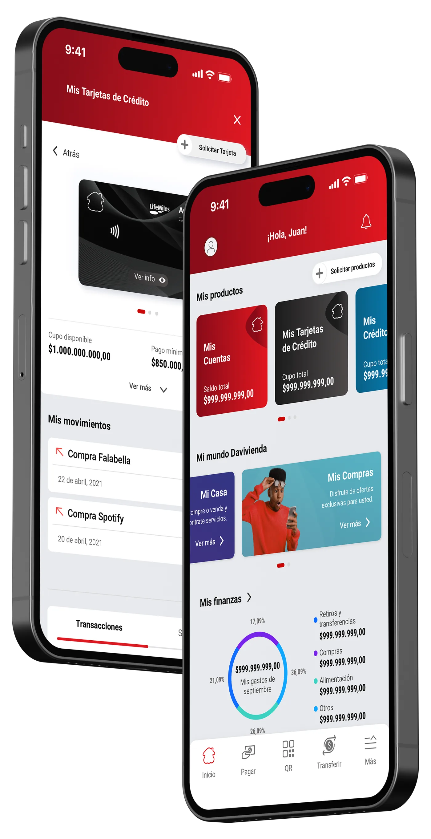
Transforming the app’s old interface and experience into a Super App.
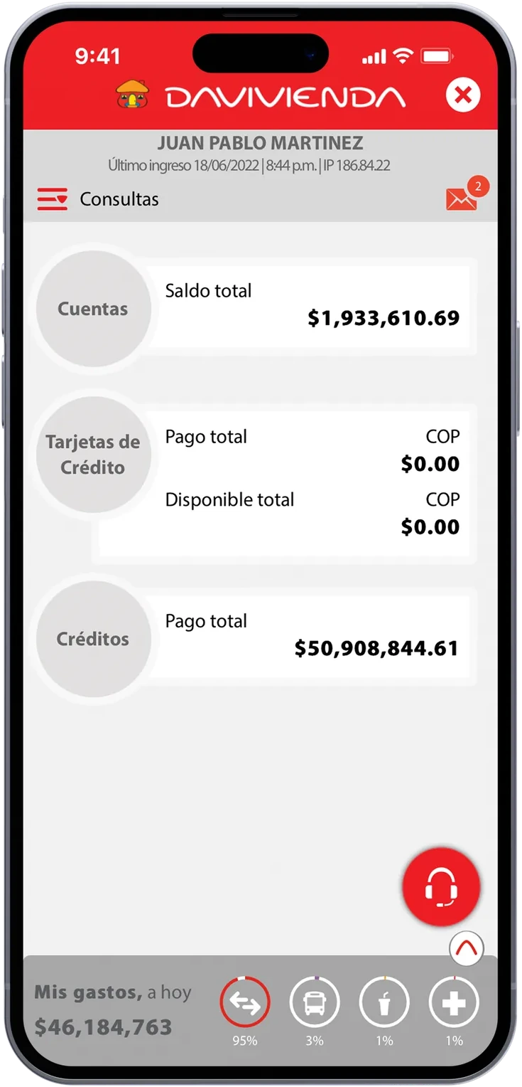
Old, boring and difficult to use 🙁
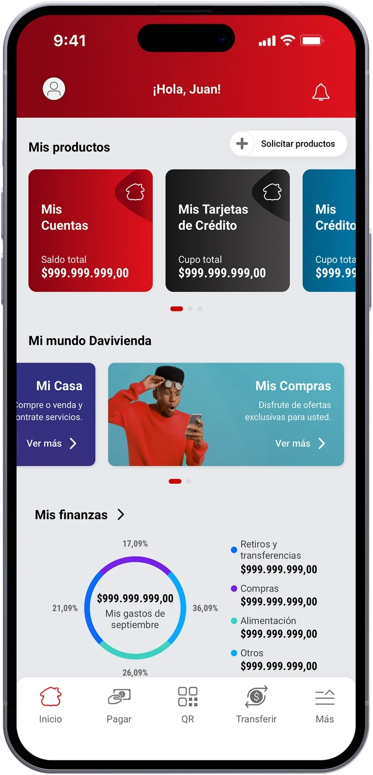
Fresh, usable, striking, user-centric. 😎
02Design system
The App was just the beginning.
A complete digital ecosystem awaited a redesign. That’s why we needed to create a design system for it.
This is just a sneak peek 😉
Typography
Accessibility comes first; that’s why we chose a typeface that prioritizes readability.
Roboto • Roboto Condensed
Aa Bb Cc Dd Ee Ff Gg Hh Ii Jj Kk Ll Mm Nn Ññ Oo Pp Qq Rr Ss Tt Uu Vv Ww Xx Yy Zz
Aa Bb Cc Dd Ee Ff Gg Hh Ii Jj Kk Ll Mm Nn Ññ Oo Pp Qq Rr Ss Tt Uu Vv Ww Xx Yy Zz
1 2 3 4 5 6 7 8 9 0
Principal colors
Different product families coexist at Davivienda, and we seek to provide each with its identity.


Iconography
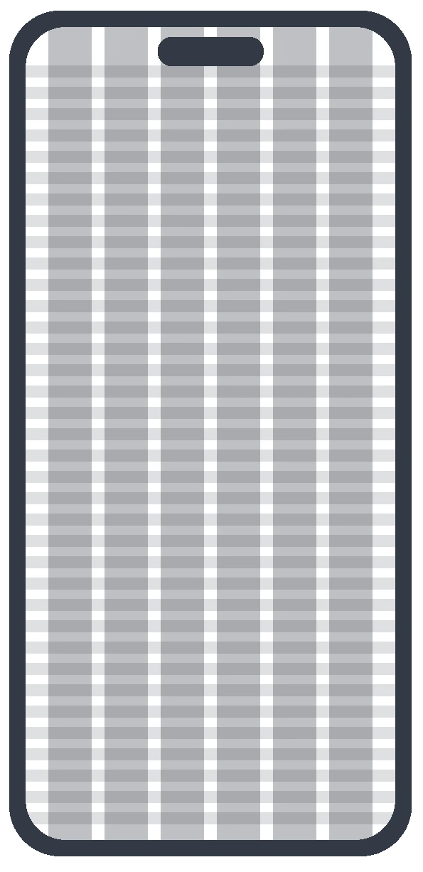
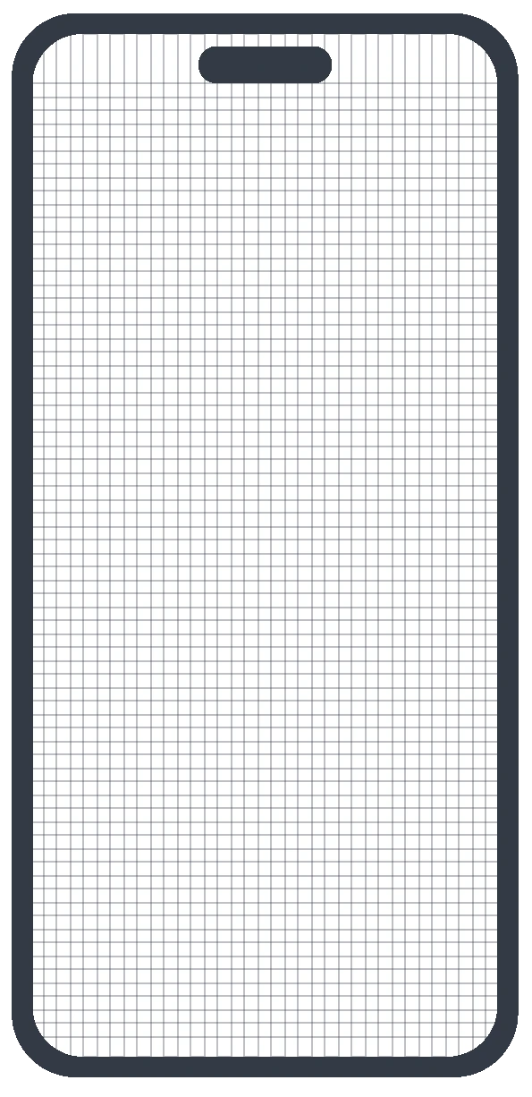
One outlined set, drawn on a 20px grid, so every action in the app reads the same way.


Components
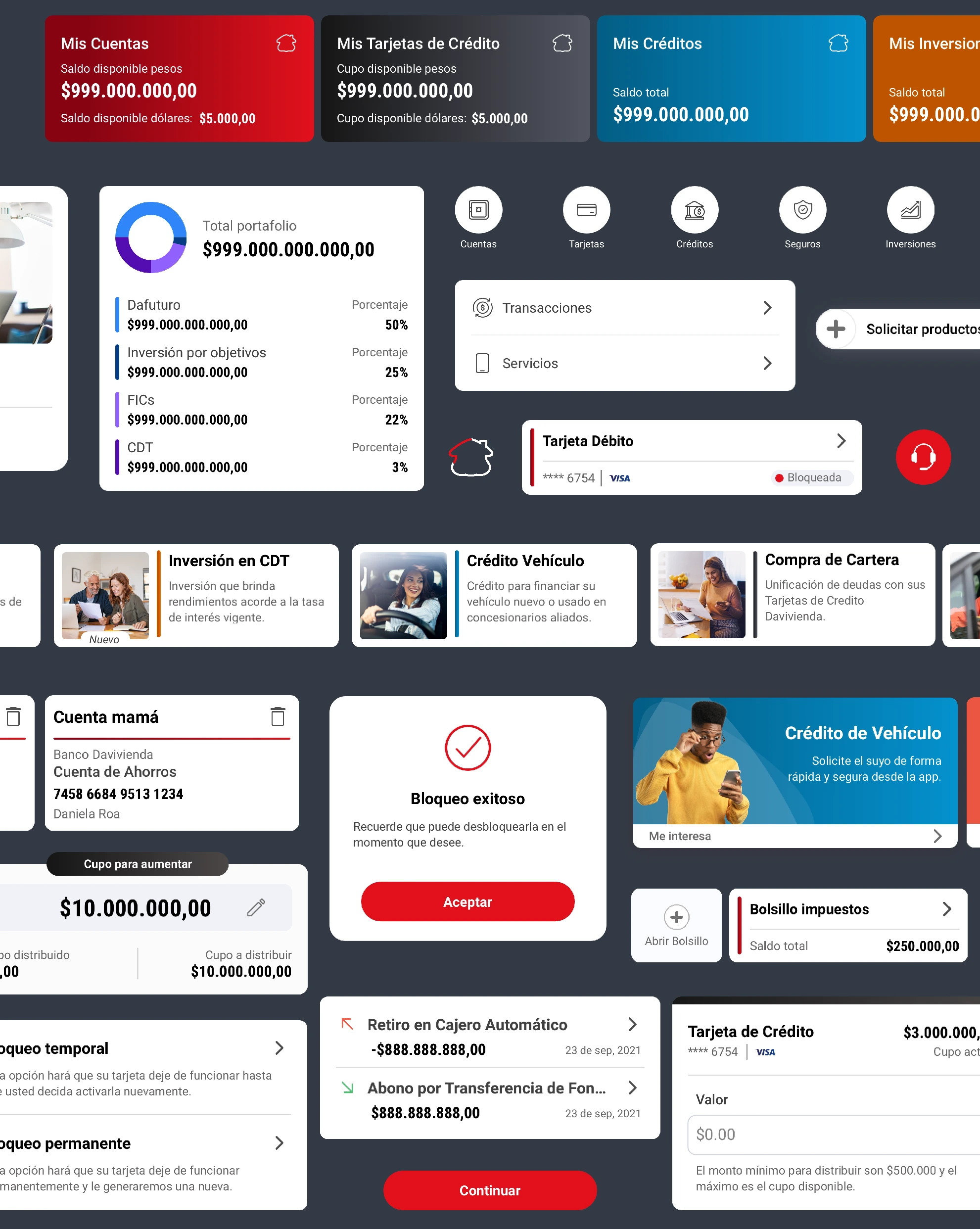
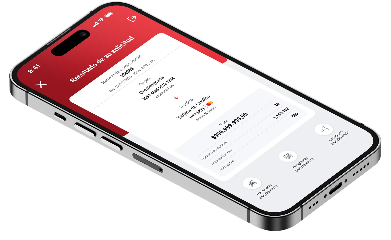
We used Atomic Design principles to create functional and adaptable components for multiple channels, catering to transactional, service, informational, and promotional experiences unique to each channel.
03Product visual
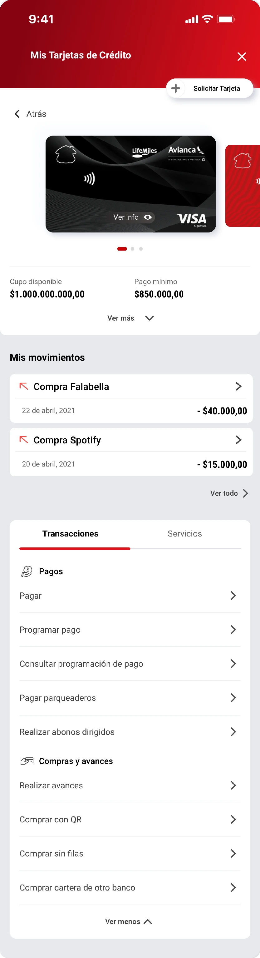
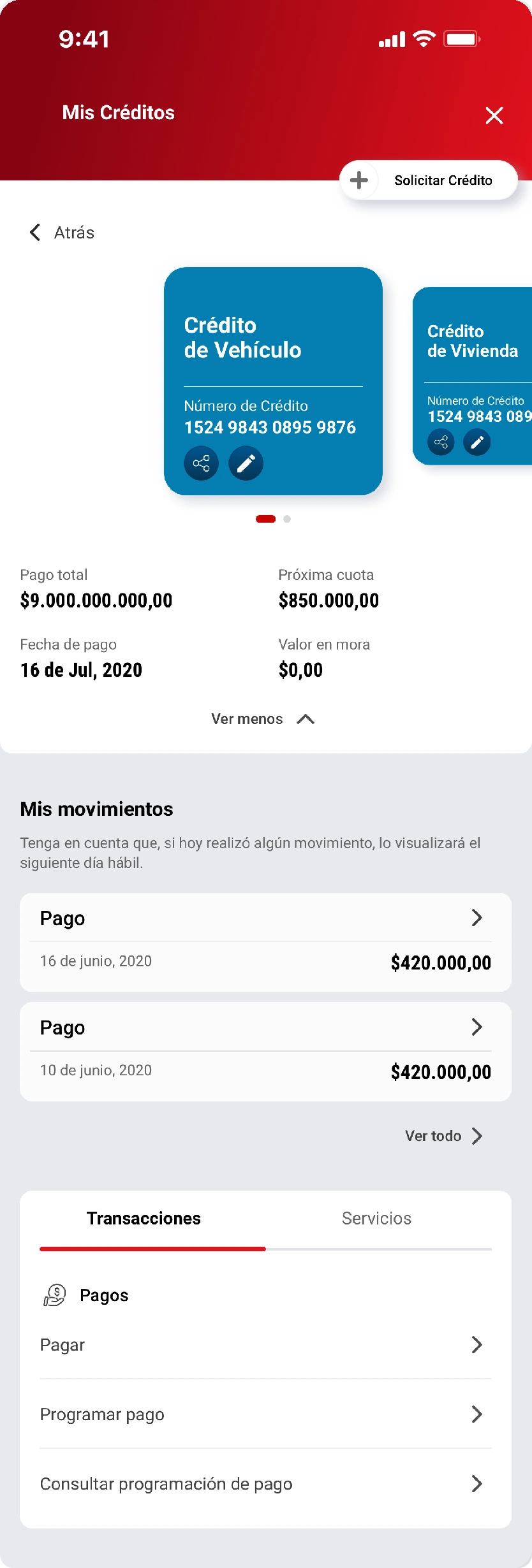
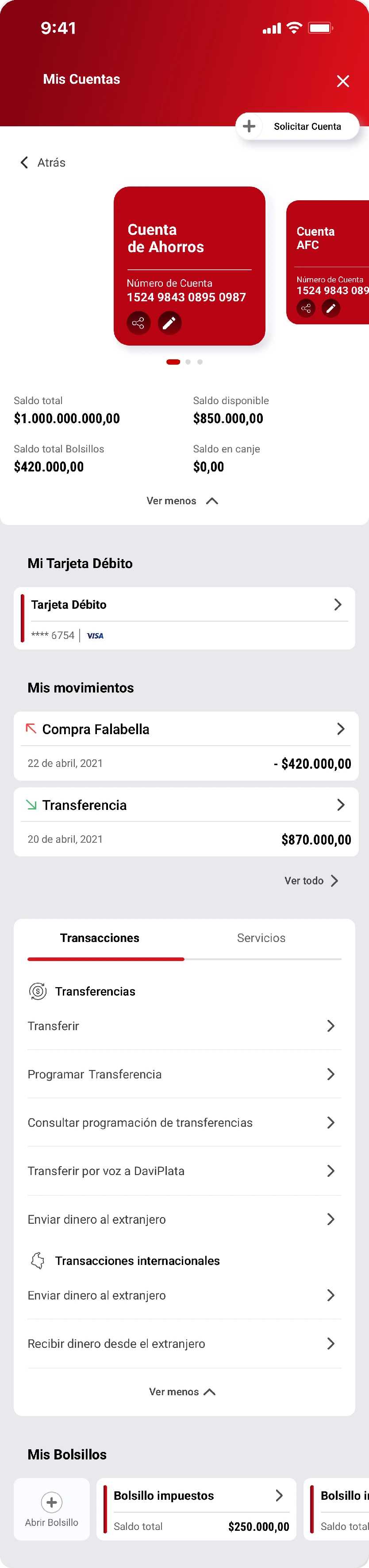
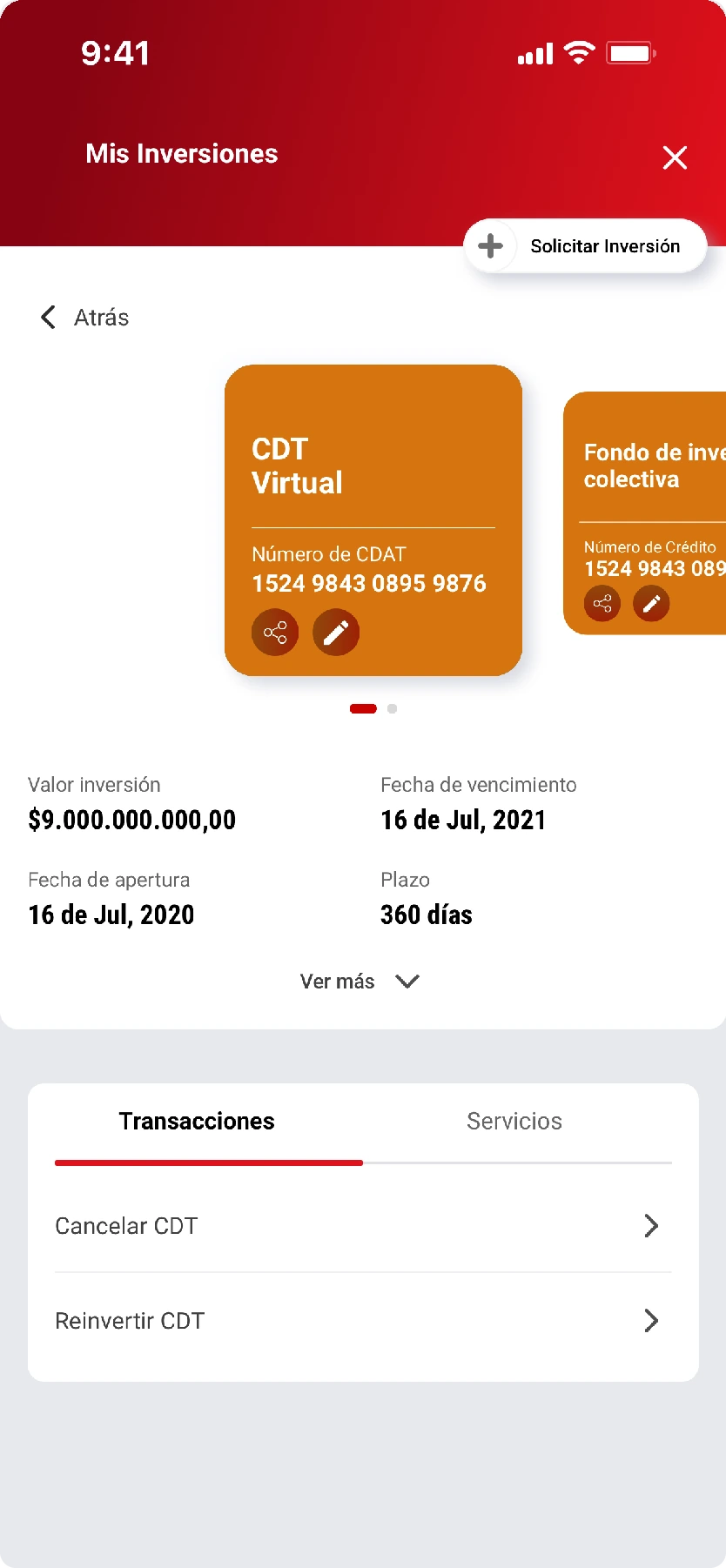
We integrated a product visual with details, functionalities, and services of each one.
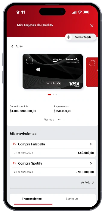
Every product family got its own card and colour, so people recognize what they own at a glance: accounts, cards, loans and investments.
04Profiles
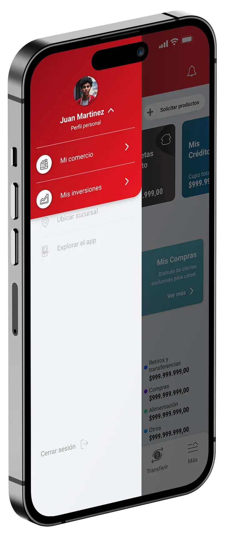
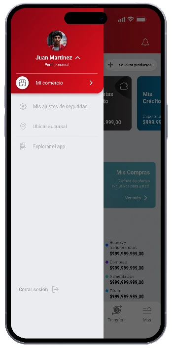
A personalized experience with different profiles.
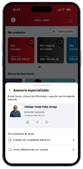
Unlock the possibilities to manage your personal finances, investments, and business.
An “All in one” experience 🤓
05Transactions
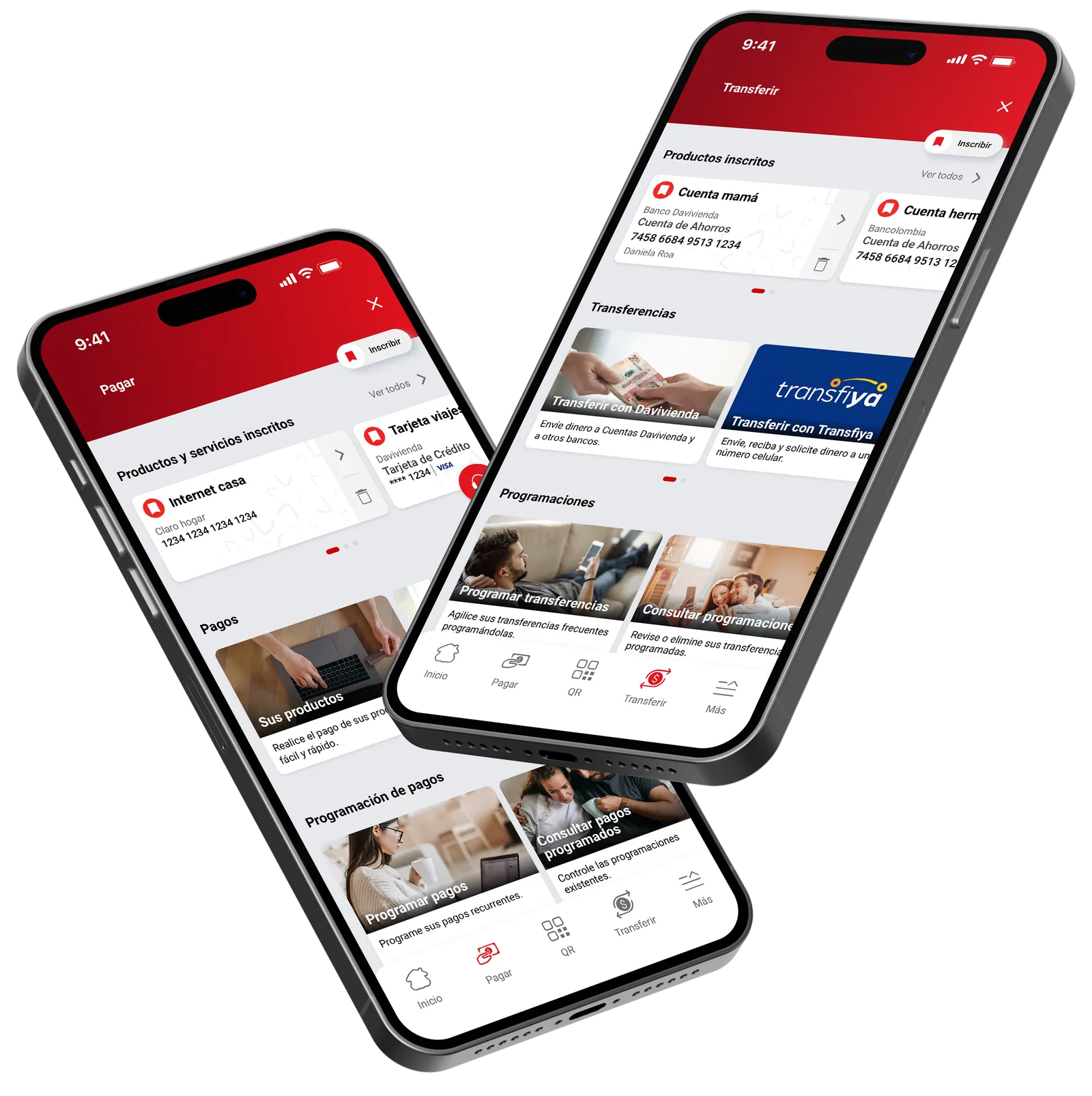
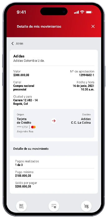
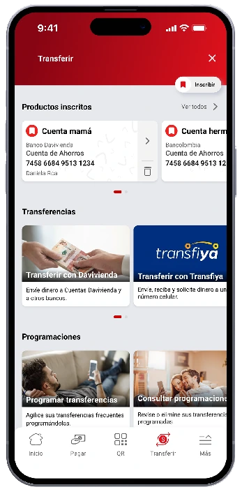
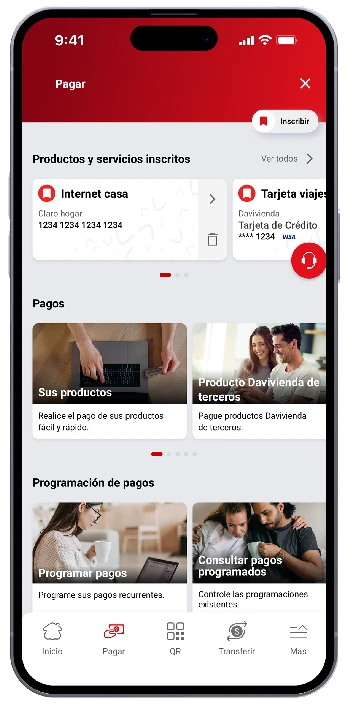
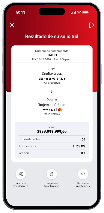
Efficient transactions, payments, and frequent destination enrollment in a revamped dashboard.
The most used flows in the app got the most attention: fewer steps, clearer states, and the destinations people use every day one tap away.
06Summary
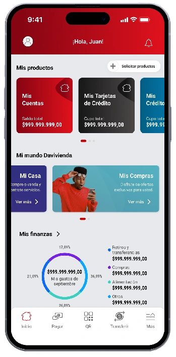
To summarize, this was the change.
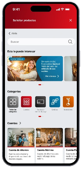
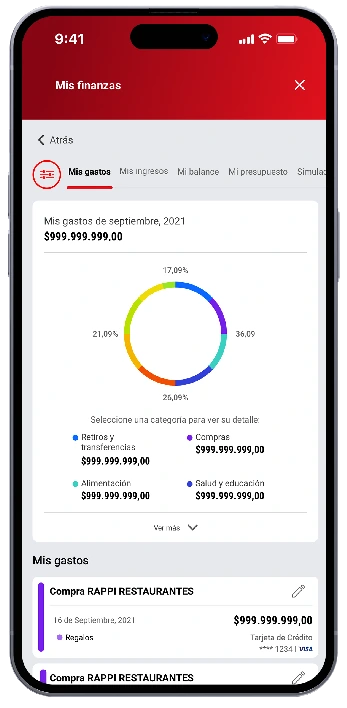
Well, just a fragment. 🤏 Ten of the screens that ship in the Super App today.
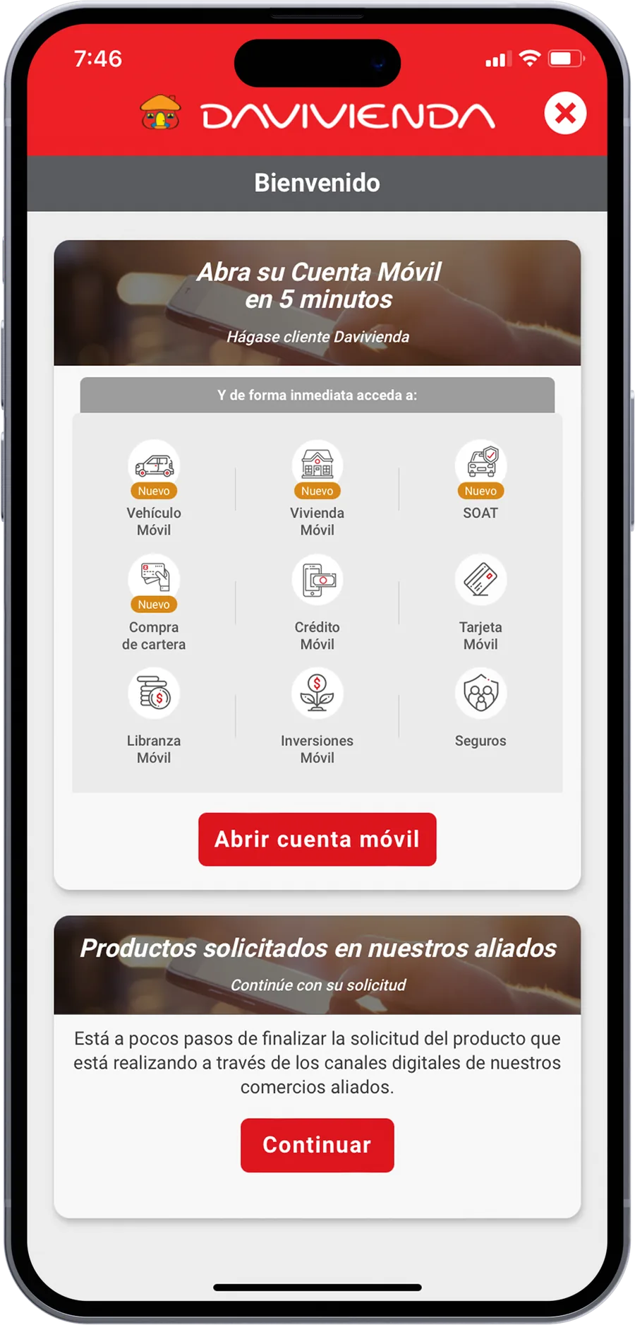
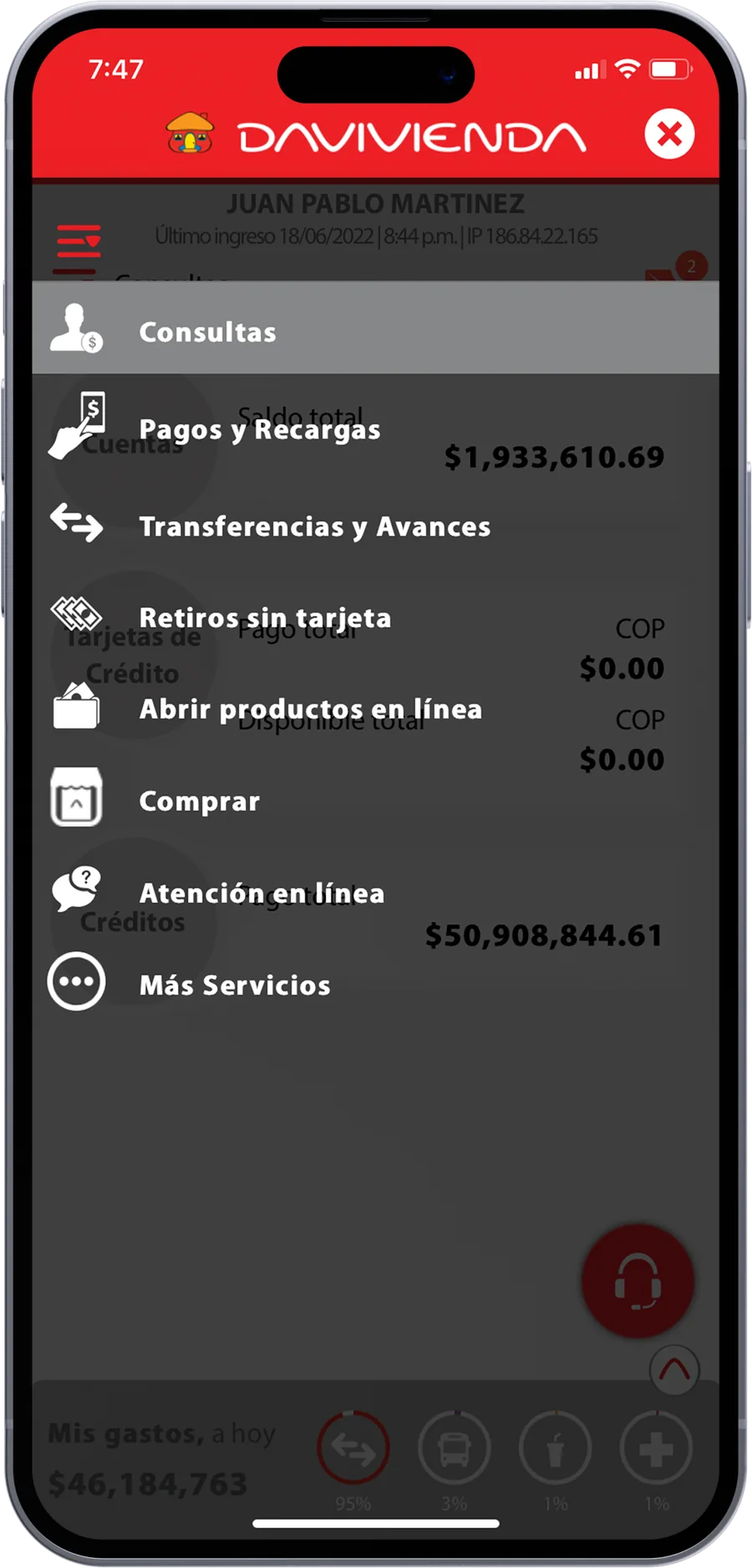
07Before
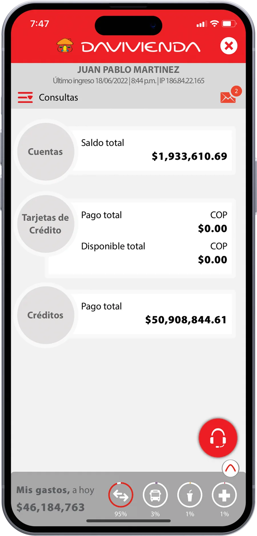
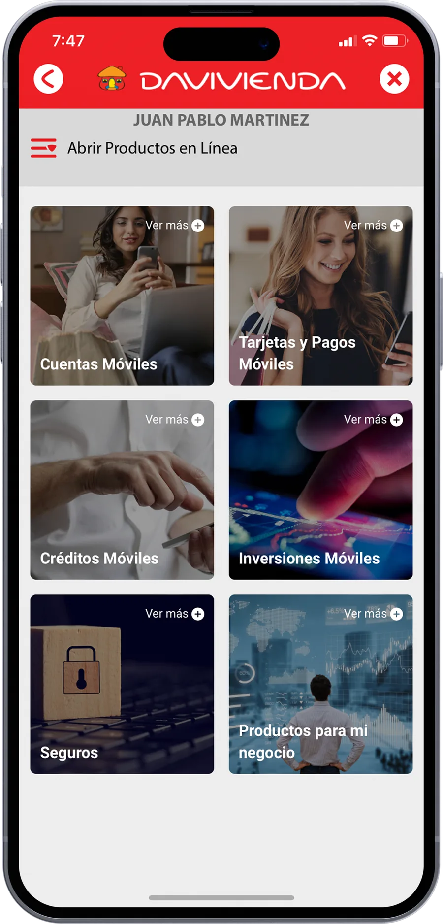
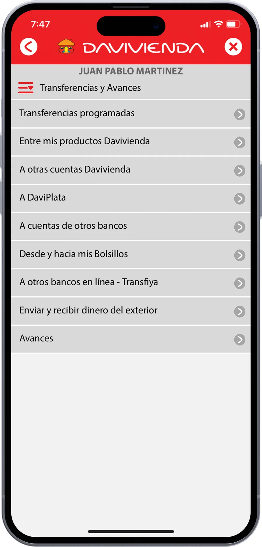
And that’s how it used to be…
List-driven, one red header for everything, and no product identity. Every screen was rebuilt.
😅 Was a good change, wasn’t it?
 Next project · Google Chrome · Huge Inc. · 2025