 Banco Davivienda · 2024
Better structure, better experience.
Rebuilding the information architecture, design system, and product experience for Colombia’s second largest bank website.
- Client
- Banco Davivienda
- Role
- Sr. UX-UI Designer
- Team
- 2 Sr · 5 Jr · PO · Lead
- Year
- 2024
- Scope
- IA · web design system · 100+ product pages
01The context
Part of something bigger.
The app came first.
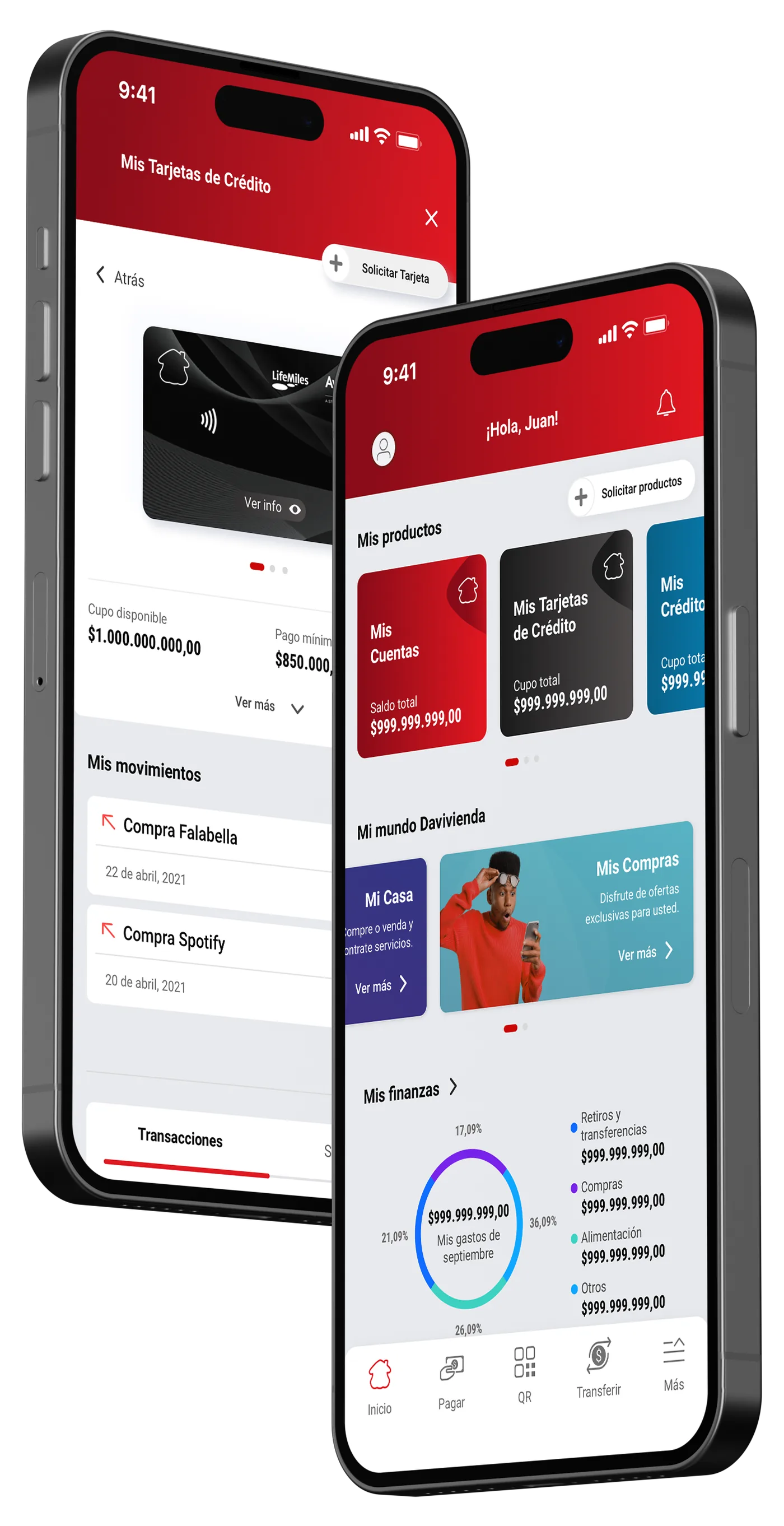
Davivienda launched a full digital transformation, redesigning every product from scratch. The Super App shipped first. The website was next, and required a completely different UX approach: wider canvas, cursor-based interactions, information-dense product pages, and a much larger surface area to make consistent.
Zero design culture. Real ambition.
No design tools. No design system. No designers. Until us.
Davivienda had never had dedicated UX designers on digital products. Engineers and product owners made design decisions by default. This project wasn’t just a redesign. It was building the foundations of a design practice inside a large financial institution, from scratch, with all the constraints that implies.
02My contribution
Design strategy and execution, from the heuristic audit that defined the problem to the design system that scaled the solution.
Sr. UX-UI Designer ×2 • Junior Designers ×5 • Product Owner • Design Lead & Manager
UX Audit & Information Architecture
Ran a full heuristic evaluation of the existing site and made the redesign of the information architecture, from content inventory to audience-first navigation structure.
Web Design System
Extended the mobile design system to the web context, redefining type scales, spacing, grids, interaction states, and 40+ components for cursor-based interfaces.
Key Screen Design
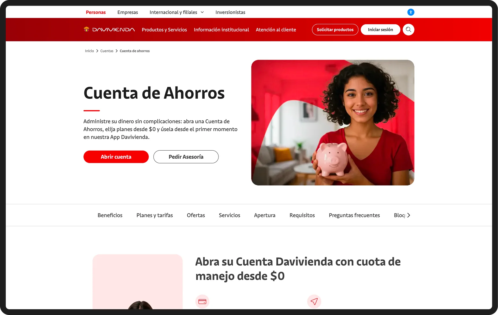
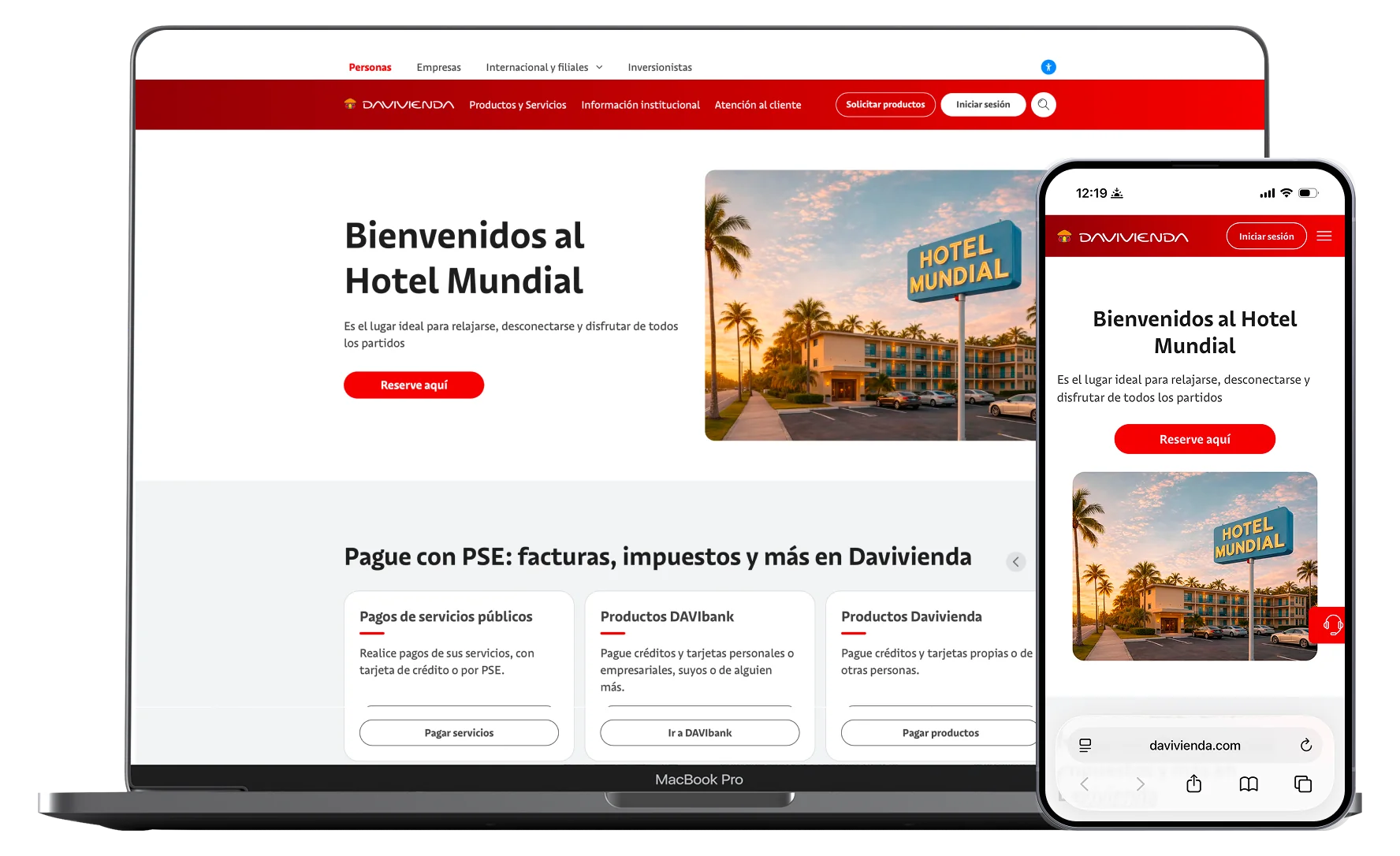
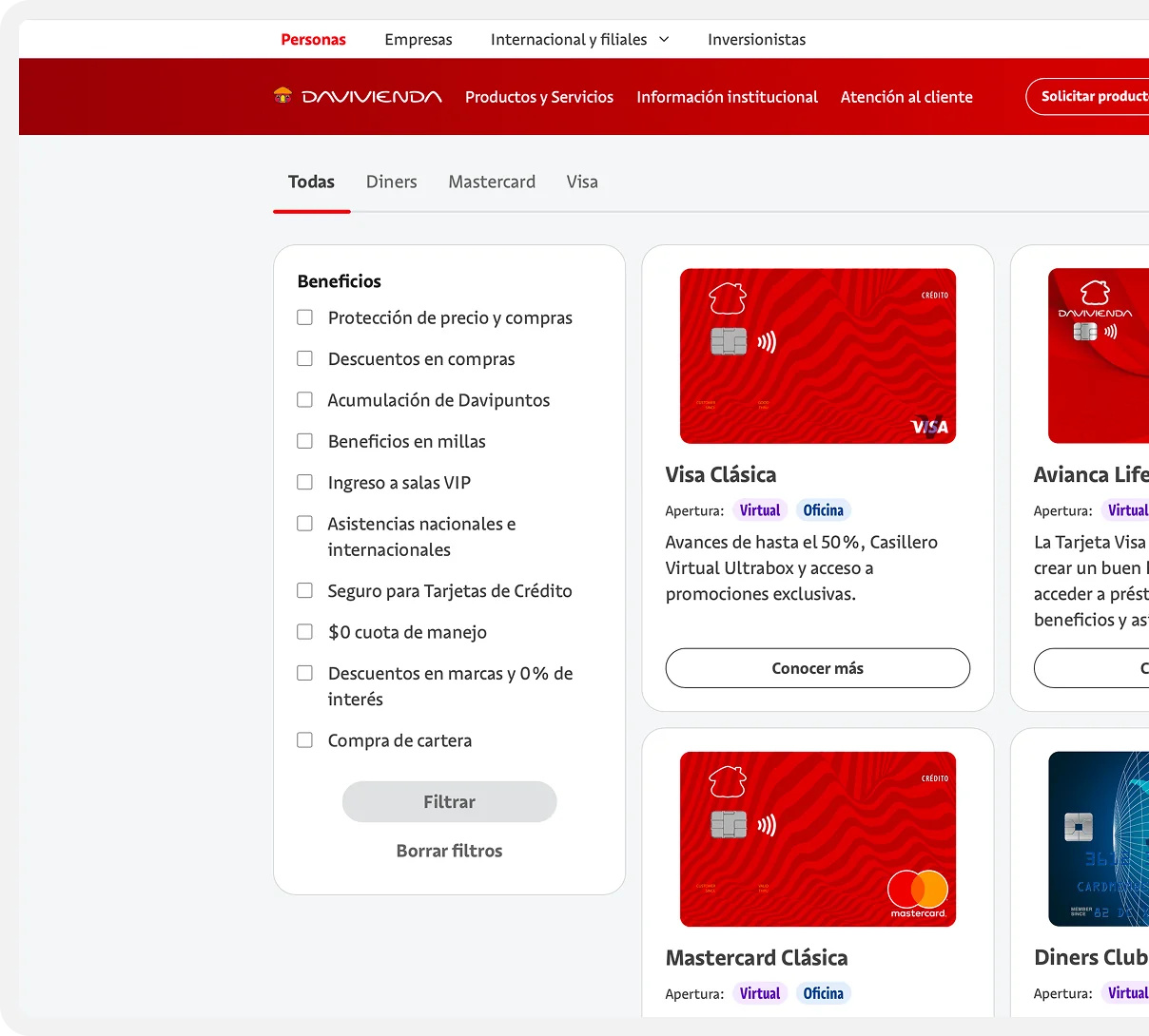
Designed the homepage, product template, and core product pages through structured critique cycles, from first concept to final iteration.
Design Advocacy & Mentoring
Pushed for UX-grounded decisions with product owners and leadership. Mentored junior designers in applying the templates and UI patterns built by the senior designers.
03The problem
A textbook case of
system-centered design.
The site was built by engineers making design decisions, section by section, team by team, with no shared language and no user perspective. The result: navigation organized around the bank’s organization instead of how customers think about money. Products buried under five levels of hierarchy. Zero consistency between sections. No recognizable patterns to anchor users anywhere on the site.
The shift
From how the bank thinks to how users navigate.
The problem was not just visual. The site failed at the structural level, before any user even saw a pixel of design.
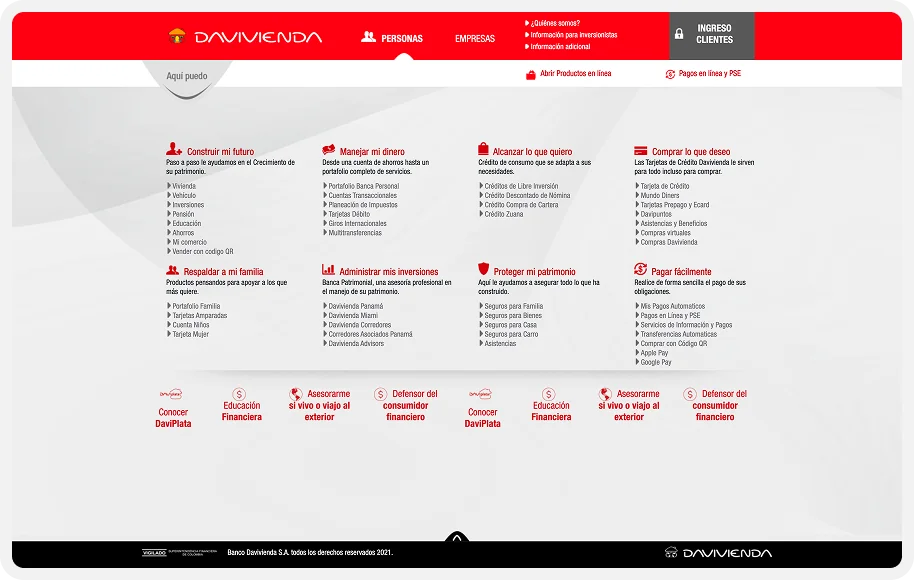
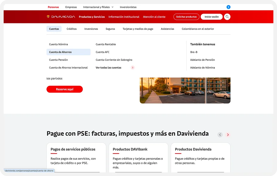
Navigation mirroring the bank’s internal departments. Products buried 5+ levels deep. No recognition patterns across sections. URL structures exposing backend architecture to users.
User first architecture with max 3 levels of hierarchy. Products organized by user goals. Consistent visual patterns to reduce cognitive load. One recognizable system throughout.
Navigation used internal business unit names, not the language customers use to think about banking.
No shared component system. Each section had its own layout logic, patterns, and visual language.
Products required 5+ clicks to reach. No wayfinding. Users memorized paths rather than recognized them.
Pages were dense, unstructured, and overloaded with secondary content competing with primary user tasks.
04The strategic insight
The site matched how the bank was organized. We redesigned it to match how users think about banking.
In UX terms: we shifted from a system-centered taxonomy to a mental-model-driven information architecture. That single decision determined everything: the new navigation, the page hierarchy, the product template, and the design system built to support it all.
05The hardest problem, Part 1
Adapting a design system isn’t translation. It’s redesign.
The mobile app had a solid, considered design system, built entirely for touch interfaces on a small canvas. The web required a fundamentally different set of decisions: cursor interactions, hover states, focus management, a wider grid, and component variants that behave differently across breakpoints.
Every design token had to be re-evaluated. Spacing that works at 375px breaks at 1440px. A tap target designed for a thumb isn’t the same as a click target designed for a cursor. The system had to be rebuilt for context, not just scaled up.
Type scales & spacing tokens
Rebuilt for 1440px, 768px, and 375px breakpoints.
Interaction states
Hover, focus, active, disabled. None exist on touch.
40+ component variants
Inherit from mobile, adapt, or build new. Decided per component.
Accessibility foundations
Focus states, color contrast ratios, and semantic structure.
06The hardest problem, Part 2
One template. 100+ products.
The UX constraint: one layout pattern had to scale across every product in the bank. “No exceptions”.
Flexible enough for every edge case
A savings account has 3 benefits. A credit card has 12 variants, rate comparison tables, and partner logos. The template had to accommodate both without breaking the visual hierarchy or requiring a new layout every time.
Simple enough for junior designers
The template had to be a system, not a puzzle. Junior designers needed to pick it up and apply it independently, without losing consistency. Designing for scalability meant designing for the people who’d use it after me.
Defensible to every stakeholder
Every product team believed their product needed its own layout. Part of the UX work was making the template feel like an opportunity, not a constraint, and having the UX rationale to back it up in every room I presented it.
07The process
Five phases. One direction.
Every phase was grounded in a UX rationale, not just a deliverable.
Built a complete content inventory in Octopus: every page, section, navigation path, and dead end across the existing site. Documented levels of hierarchy, duplicated content across sections, and navigation labels matching internal business units rather than user language. This audit became the evidence base for every structural argument that followed.
Used Mobbin to analyze how leading banks (Bancolombia, Nubank, BBVA, Itaú) handle navigation depth, product page structure, audience segmentation, and CTA hierarchy. The goal wasn’t visual inspiration: it was identifying industry-validated UX conventions that could complement direct user testing made by the research team.
Designed a new IA grounded in how customers actually think about banking: by who they are and what they actually need, not by which department owns the product. Applied card sorting principles to rewrite navigation labels in user language. Validated each proposed structure with cognitive walkthroughs before presenting to stakeholders. Every decision was backed by method, not intuition.
Built the web design system in Sketch from the ground up, adapting mobile tokens to the web context, defining new spacing scales, grid systems, and 40+ component variants covering all interaction states. Wrote usage documentation so junior designers could apply it independently, without recreating inconsistencies.
Designed the homepage, product template, and key product pages through 5+ rounds of structured critique with the design lead, evaluating each round against the same criteria: Does the visual hierarchy direct to the right action? Are affordances recognizable at first view? Does the page apply the design system consistently? The gap between round one and the shipped design was the work.
Research & Validation
The project worked alongside a dedicated research team. In parallel, the design team ran its own validation layer: expert methods that gave every structural and UI decision a defensible, method-backed rationale rather than relying on intuition alone.
Expert audit against Nielsen’s 10 Usability Heuristics
Evaluated the existing site against all 10 heuristics, documenting 7 of 10 violated at severity 3–4. A defensible baseline that drove the information architecture rationale and every major structural decision.
Step-by-step evaluation of critical user journeys
Walked through the 3 most common user goals, evaluating each step for affordance clarity, navigation predictability, and error prevention. Repeated on the new designs to validate improvements before presenting.
UX pattern analysis across 12 banking & fintech platforms
Analyzed navigation, architecture depth, and CTA patterns across Bancolombia, Nubank, BBVA, and 8 others. When 10 of 12 banks solve a pattern the same way, that’s validated convention; evidence strong enough to present as data, not preference.
Product owners as domain experts and proxy users
Structured sessions with product owners, treating their customer and business knowledge as a recognized UX research input. Their insights shaped audience segmentation and navigation labeling.
08Key screens
Where the system becomes the experience.
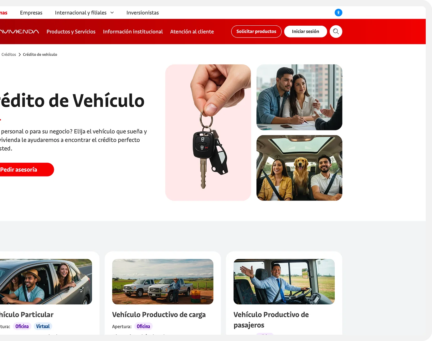
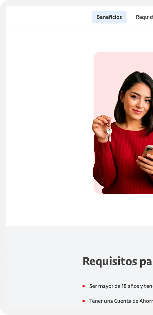
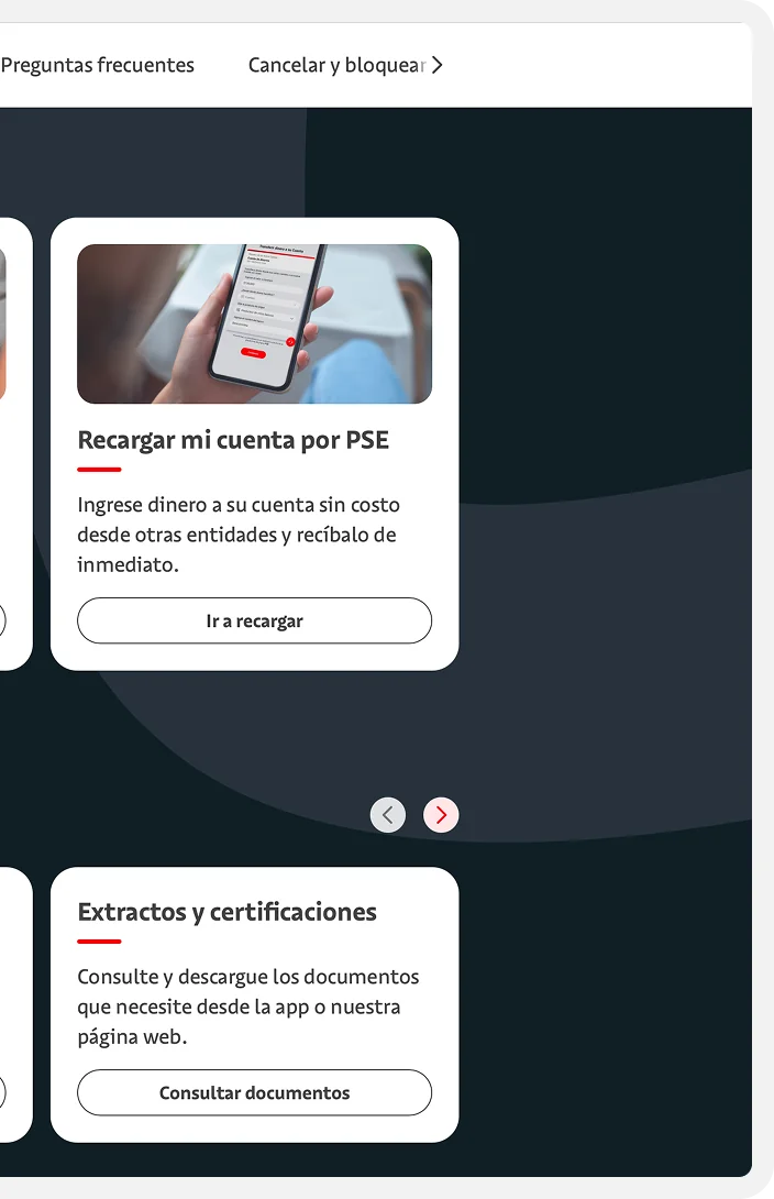
Representative pages, each applying the information architecture, the design system, and the visual hierarchy decisions in a different context.
09The outcome
No formal usability metrics.
But the UX outputs are concrete and measurable.
Architecture rebuilt from scratch
Navigation depth reduced from 5+ levels to 3 max. Department-based taxonomy replaced by audience-first structure matching users’ mental models.
One template. 100+ products.
A single product page template applied across the entire product catalog, flexible enough for every edge case, clear enough that junior designers used it without guidance.
First web design system
40+ web components with full interaction states and usage documentation. 3 designers working from the same system simultaneously, with no inconsistencies introduced.
A site that finally works the way users think.
From system centered architecture and zero design tooling to a fully shipped UX; built on rigorous method, a new design system, and a team that grew its design practice along the way.